|
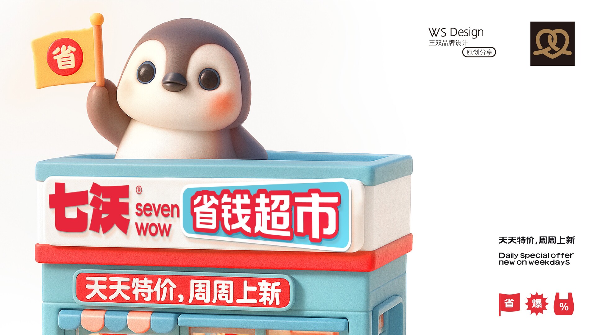
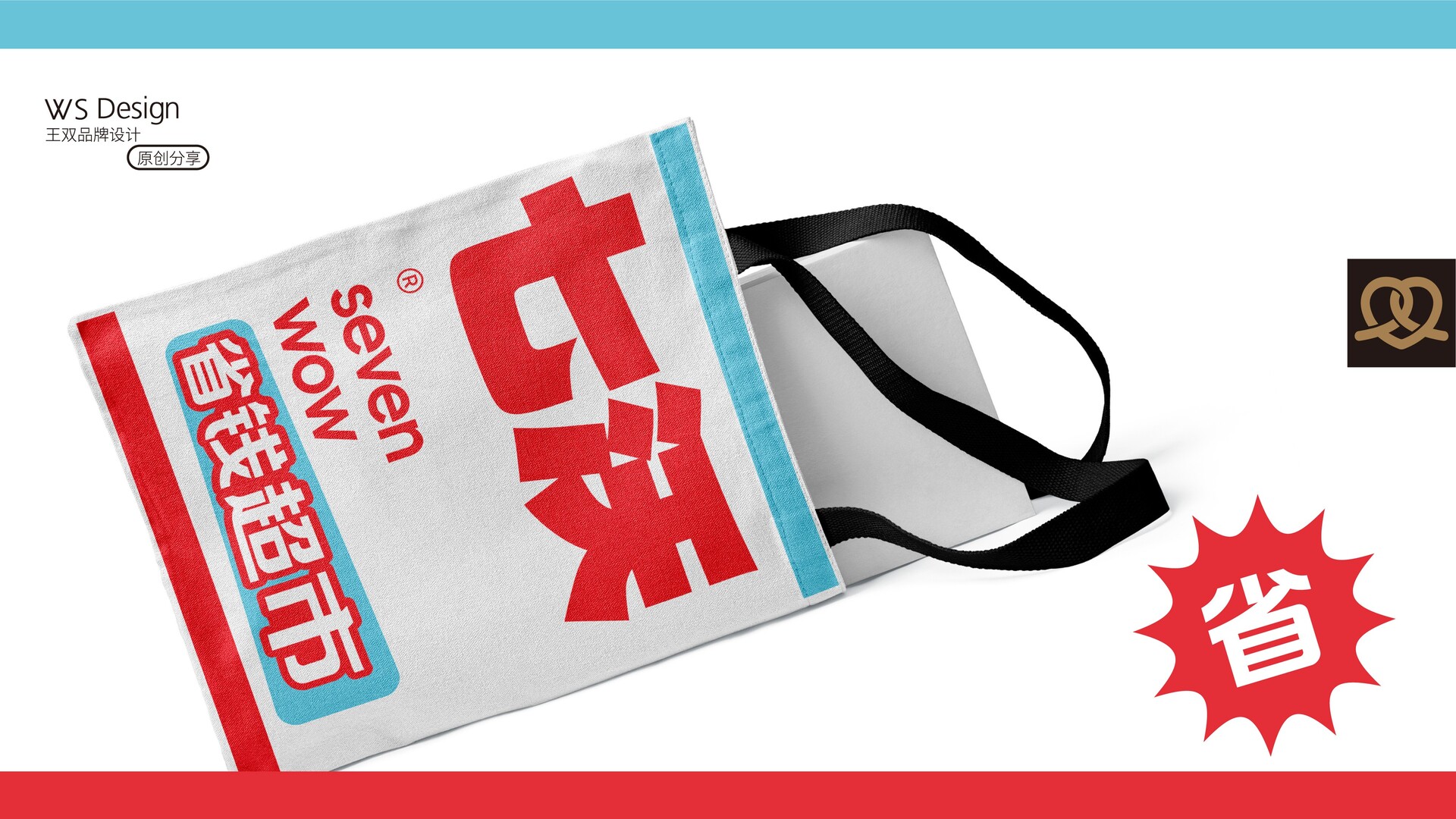
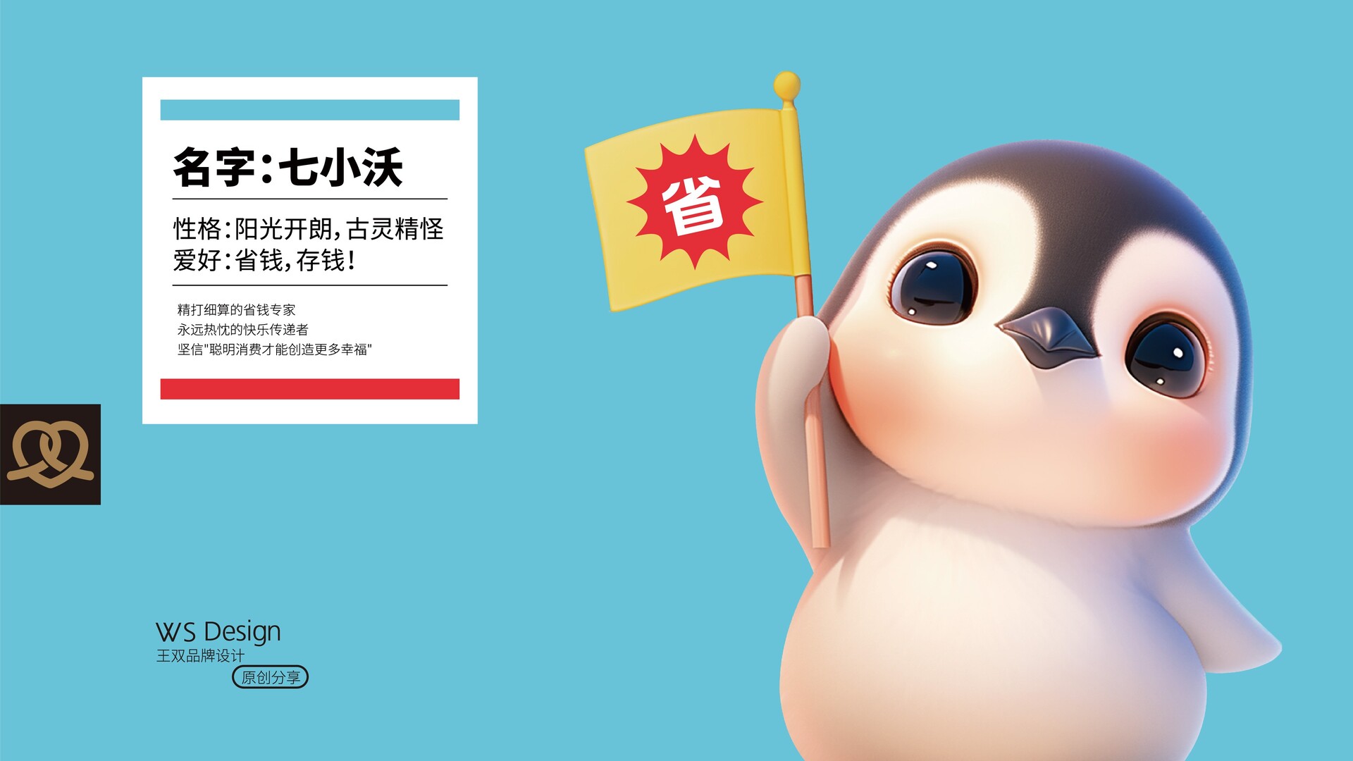
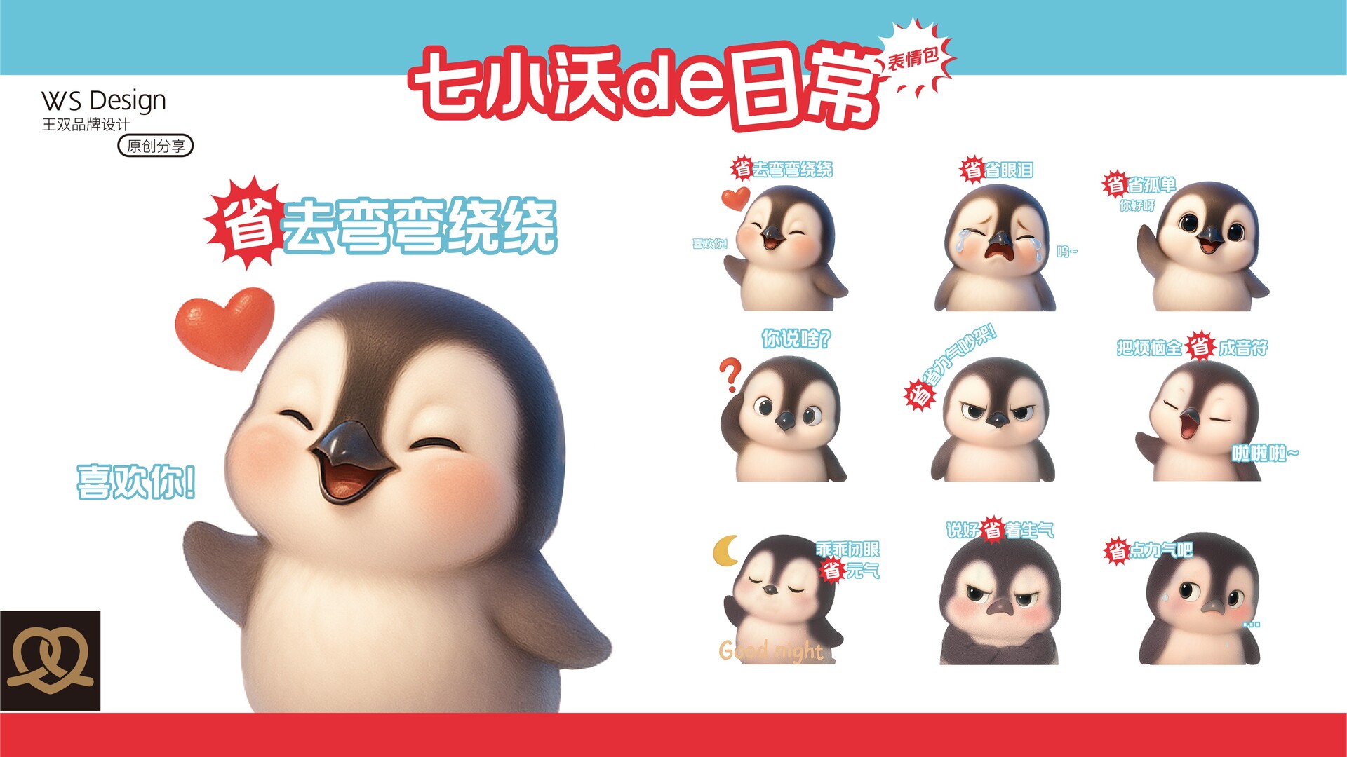
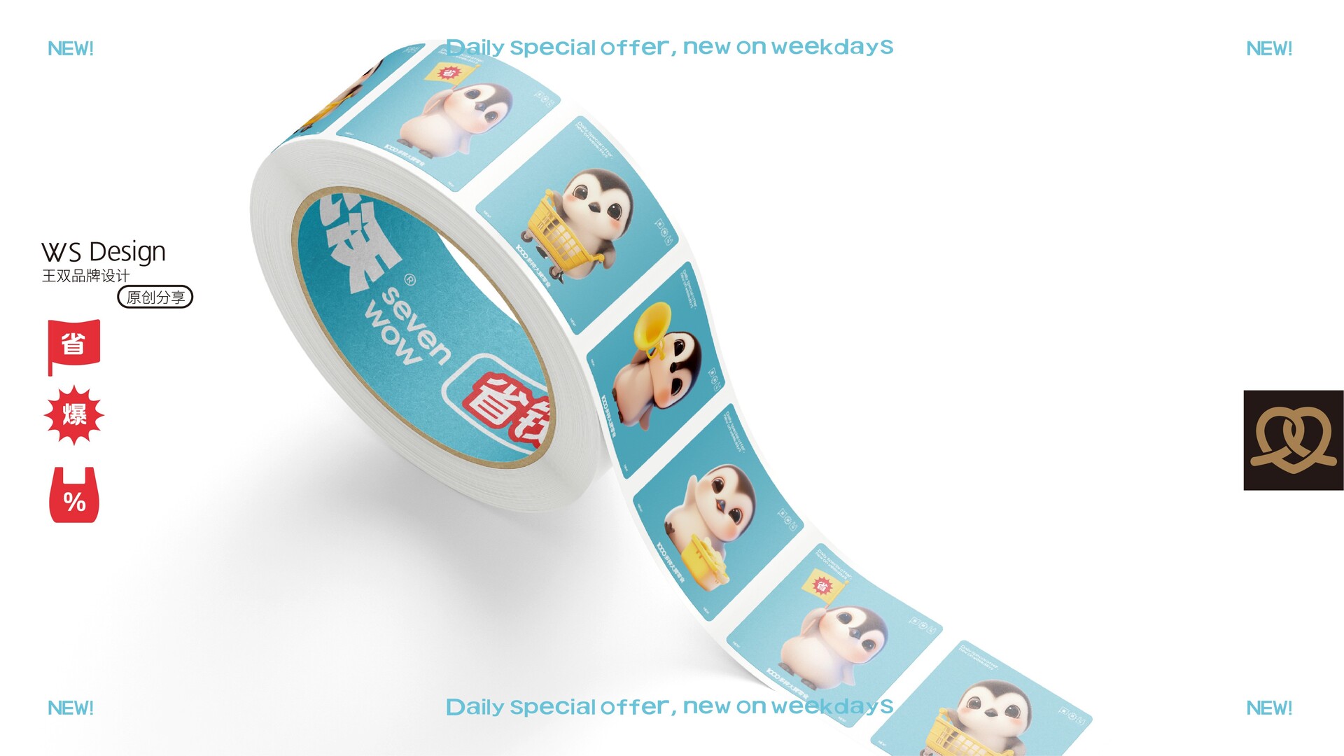
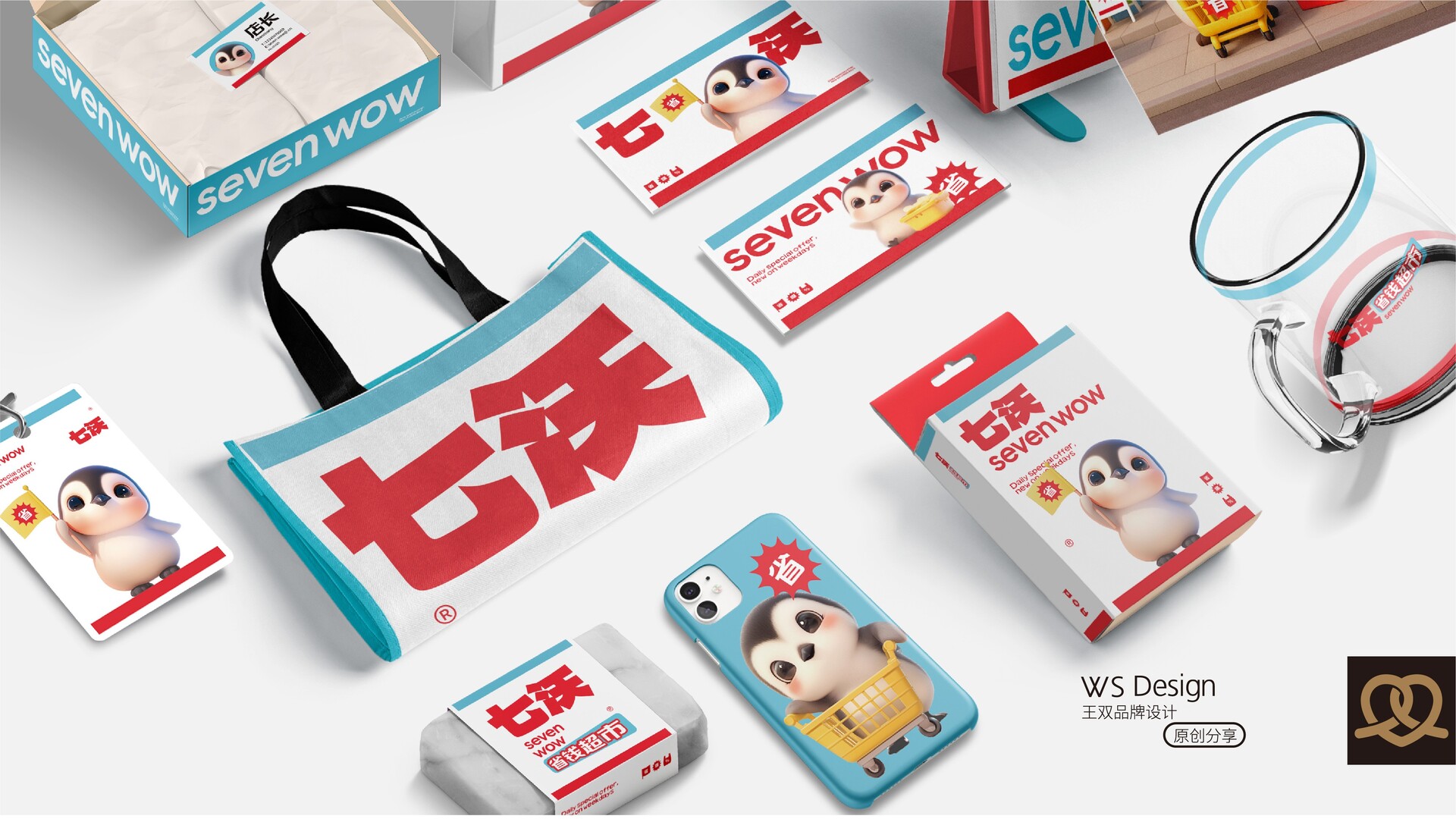
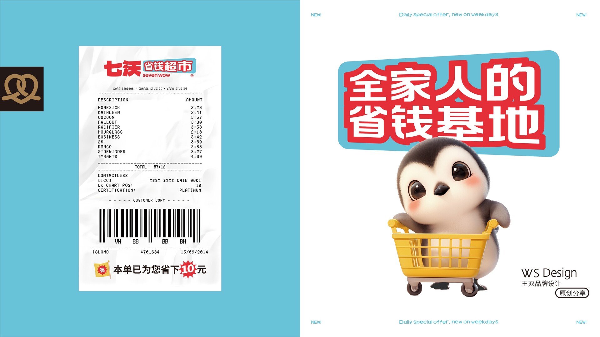
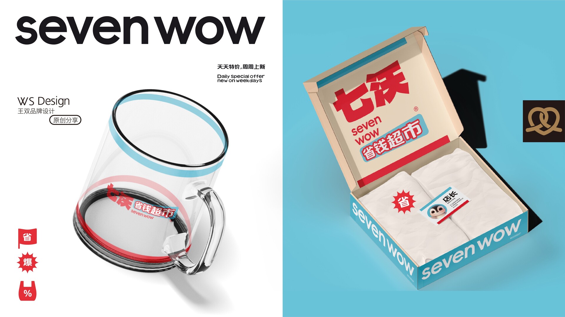
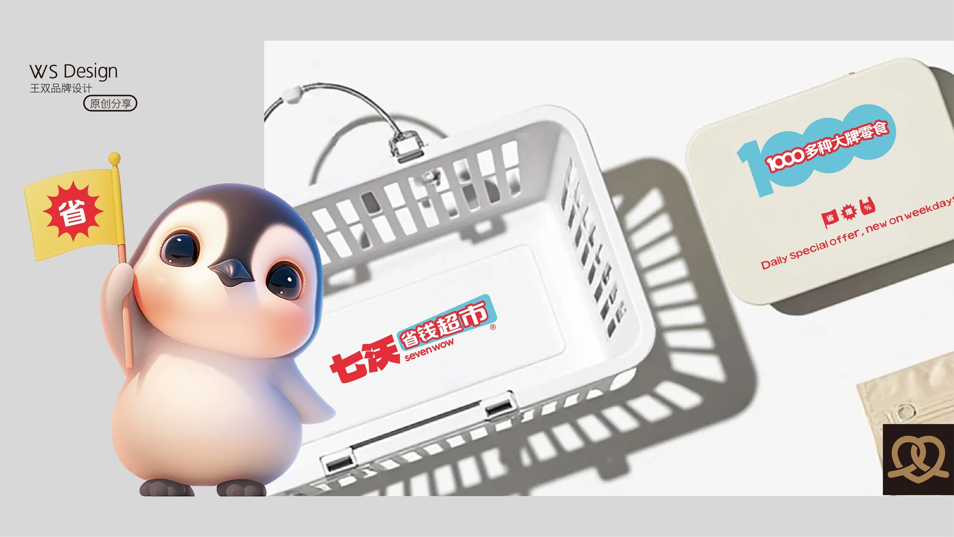
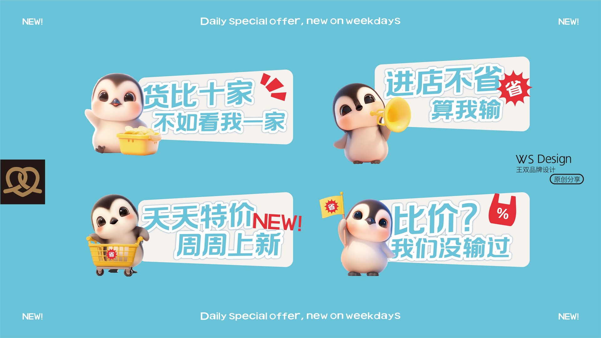
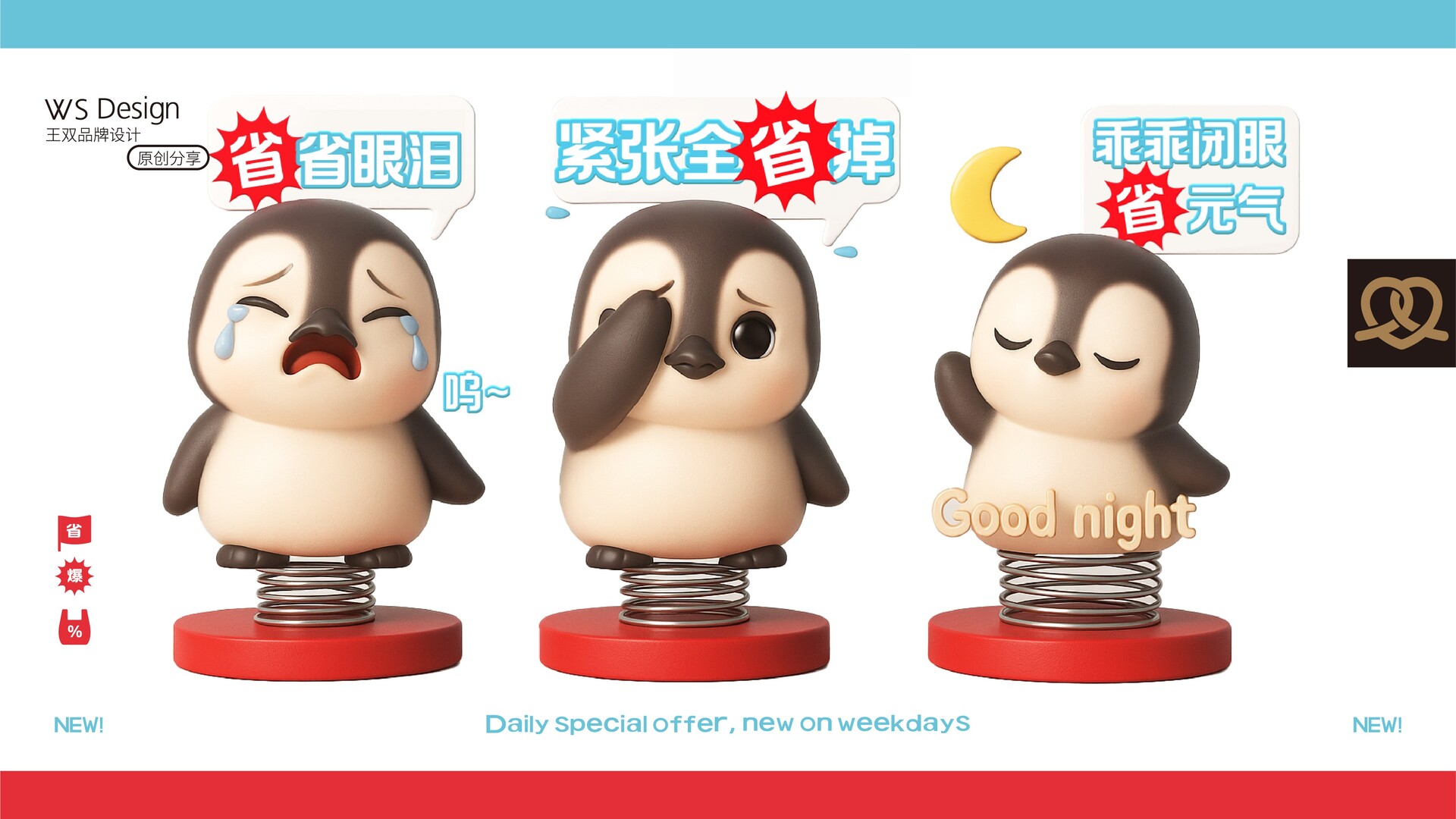
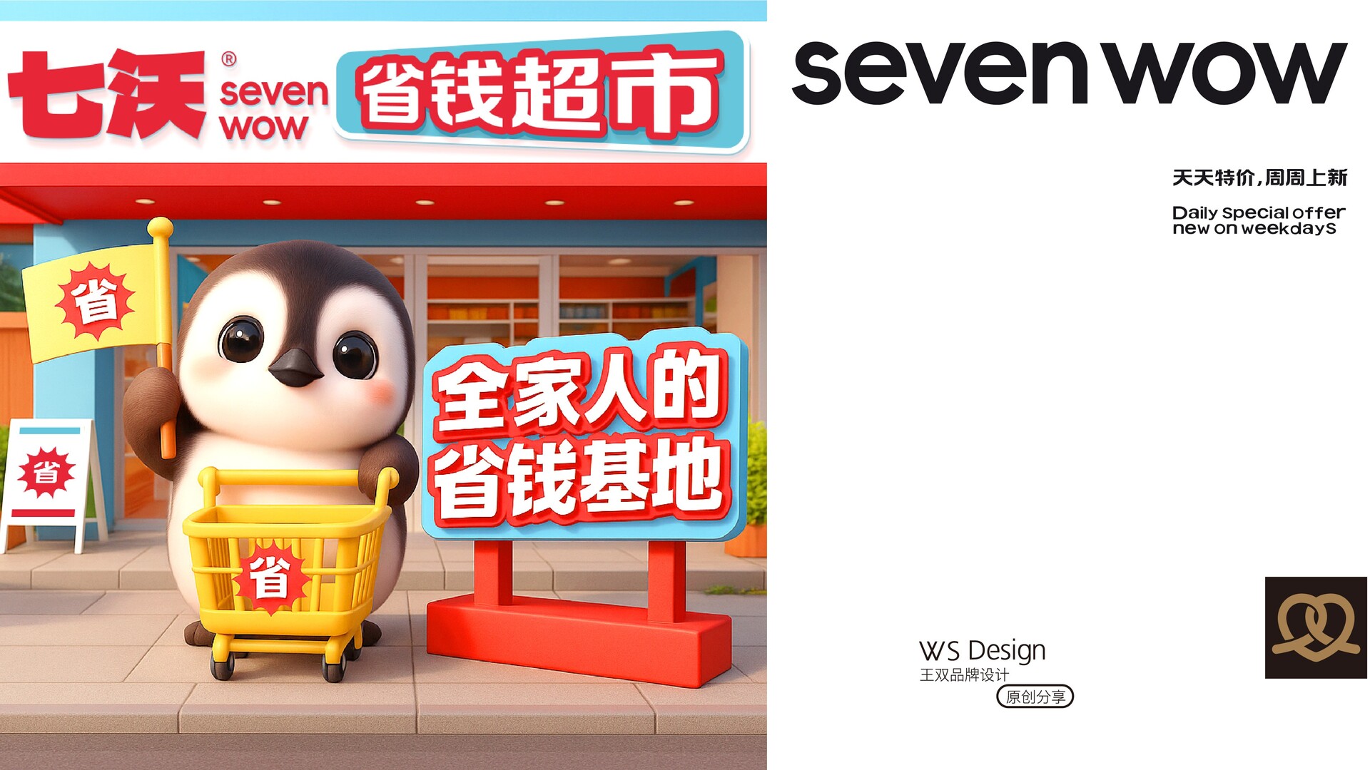
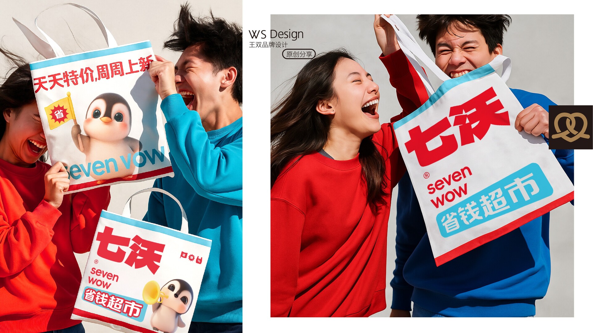
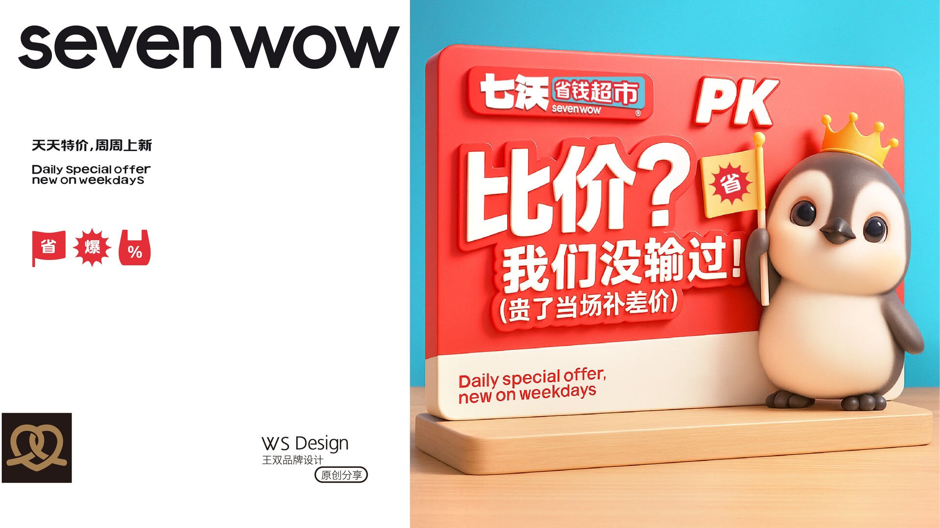
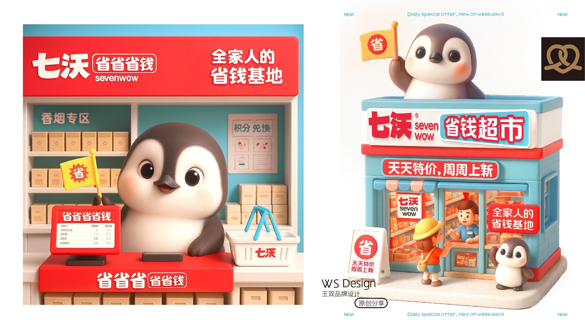
品牌视觉系统展示 | 七沃 seven wow品牌视觉全案设计 | 七沃 seven wow Brand visual design | Seven Wow 01. 品牌定位 “七沃省钱超市”致力于打造一个亲民实惠、人人都能消费得起的生活便利场所。以“省”为核心理念,用“七沃”代表一周七天每天都有惊喜优惠,“seven wow”则强化品牌的国际感与记忆点,展现品牌的年轻态度与全球化视野。 02. 视觉语言解析 色彩策略:以红色与蓝色为主色调,形成清晰对比与品牌辨识度。 • 红色象征热情、活力和价格优势,能够强力吸引消费者视线; •蓝色代表理性、信任与智慧,平衡整体气质,强化“省钱、安心”的心理感受。 字体设计: •“七沃”两字采用加粗大字型,强调品牌力量与视觉冲击力; •“省钱超市”选用圆润字体,营造亲切友好的品牌氛围; • 英文“seven wow”采用极简无衬线体,与中文形成呼应,进一步增强现代感与国际形象。 03. 吉祥物打造:七小沃 品牌卡通角色“七小沃”是一只超Q萌的小企鹅,承担与消费者情感链接的任务: • 手举“省”字小旗,强化品牌价值主张; • 多组趣味表情包展现日常互动,传递品牌温度; • 搭配3D粘土风格材质,增加治愈感、亲和力与社交传播力。 04. 品牌主张 省钱,是一种生活智慧; 亲民,是一种品牌温度。 七沃 seven wow,不只是一个超市, 而是一个全家人的省钱基地。 01 Brand Positioning "Seven Wow Savings Supermarket" is committed to creating a convenient place for people to live that is affordable and affordable for everyone. With "savings" as the core concept, "Seven Wow" represents surprise discounts every day of the week, and "seven wow" strengthens the brand's international sense and memory point, showing the brand's young attitude and global vision. 02 Visual language analysis Color strategy: Red and blue are the main colors, forming a clear contrast and brand recognition. • Red symbolizes enthusiasm, vitality and price advantage, which can strongly attract consumers' attention; • Blue represents rationality, trust and wisdom, balances the overall temperament, and strengthens the psychological feeling of "saving money and peace of mind". Font design: • The two words "七沃" are in bold and large fonts, emphasizing the brand power and visual impact; • "省钱超市" uses a rounded font to create a friendly brand atmosphere; • The English "seven wow" uses a minimalist sans serif font, which echoes the Chinese, further enhancing the modern sense and international image. 03 Mascot creation: Qi Xiaowo The brand cartoon character "Qi Xiaowo" is a super cute little penguin, responsible for the task of connecting with consumers emotionally: • Holding a small flag with the word "Province" in hand, strengthening the brand value proposition; • Multiple sets of interesting emoticons show daily interactions and convey brand warmth; • Paired with 3D clay-style materials, it increases the sense of healing, affinity and social communication. 04 Visual extension system • The door sign, shopping cart, signboard, etc. all use the word "省" as the visual anchor to form a unified system; • The overall visual style highlights "supermarket is a paradise", creating a relaxed, cute, and worthy of repeated visits; • Synchronously develop extended applications such as brand emoticons, offline props, promotional POPs, etc. to form a complete experience closed loop. 05 Brand proposition Saving money is a kind of life wisdom; Being close to the people is a kind of brand warmth. Seven Wow is not just a supermarket, but a money-saving base for the whole family.
|

