|
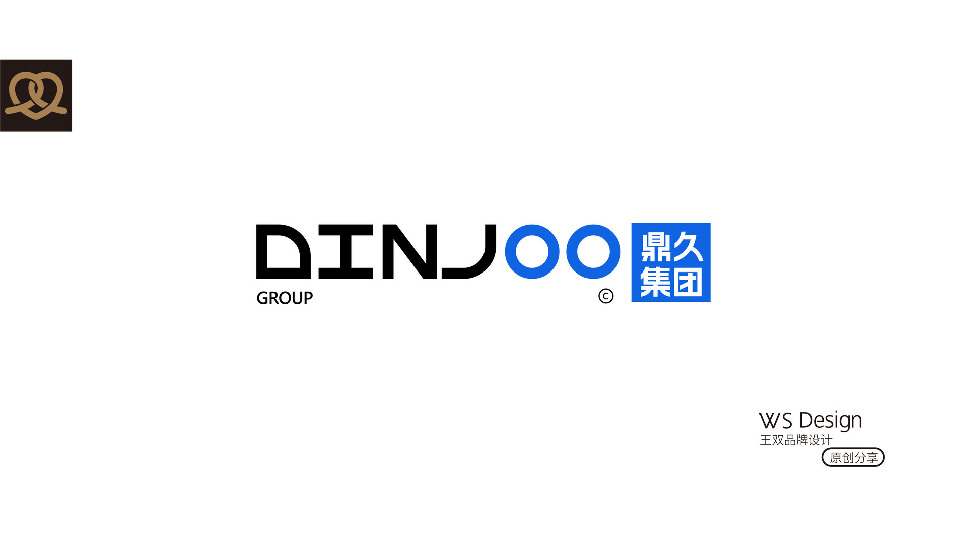
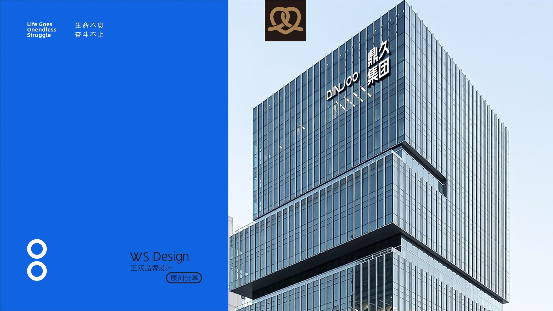
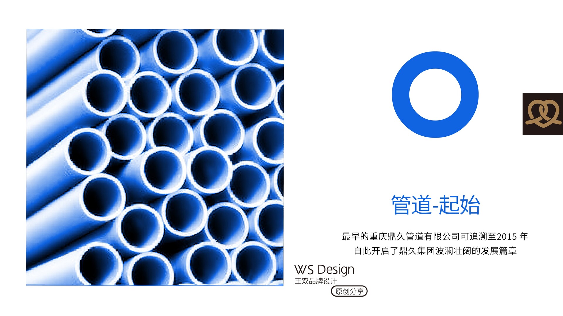
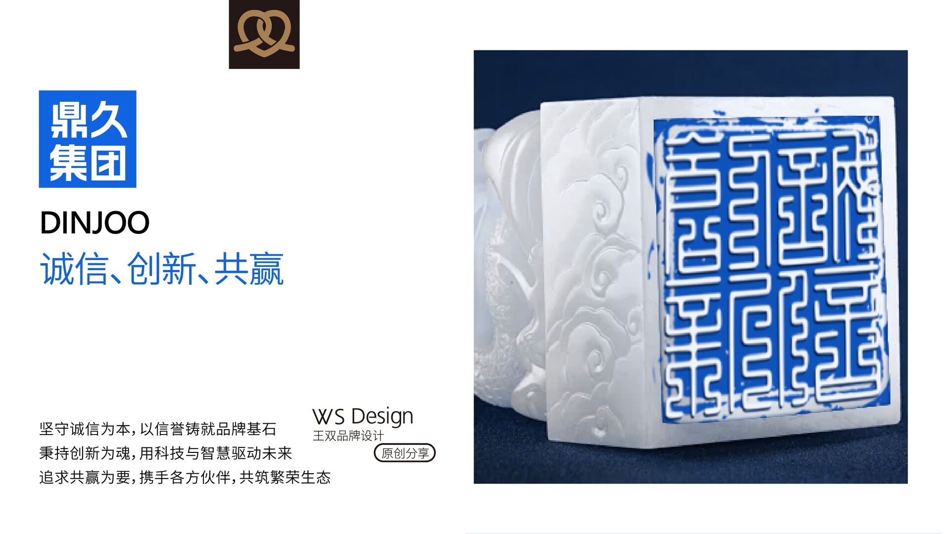
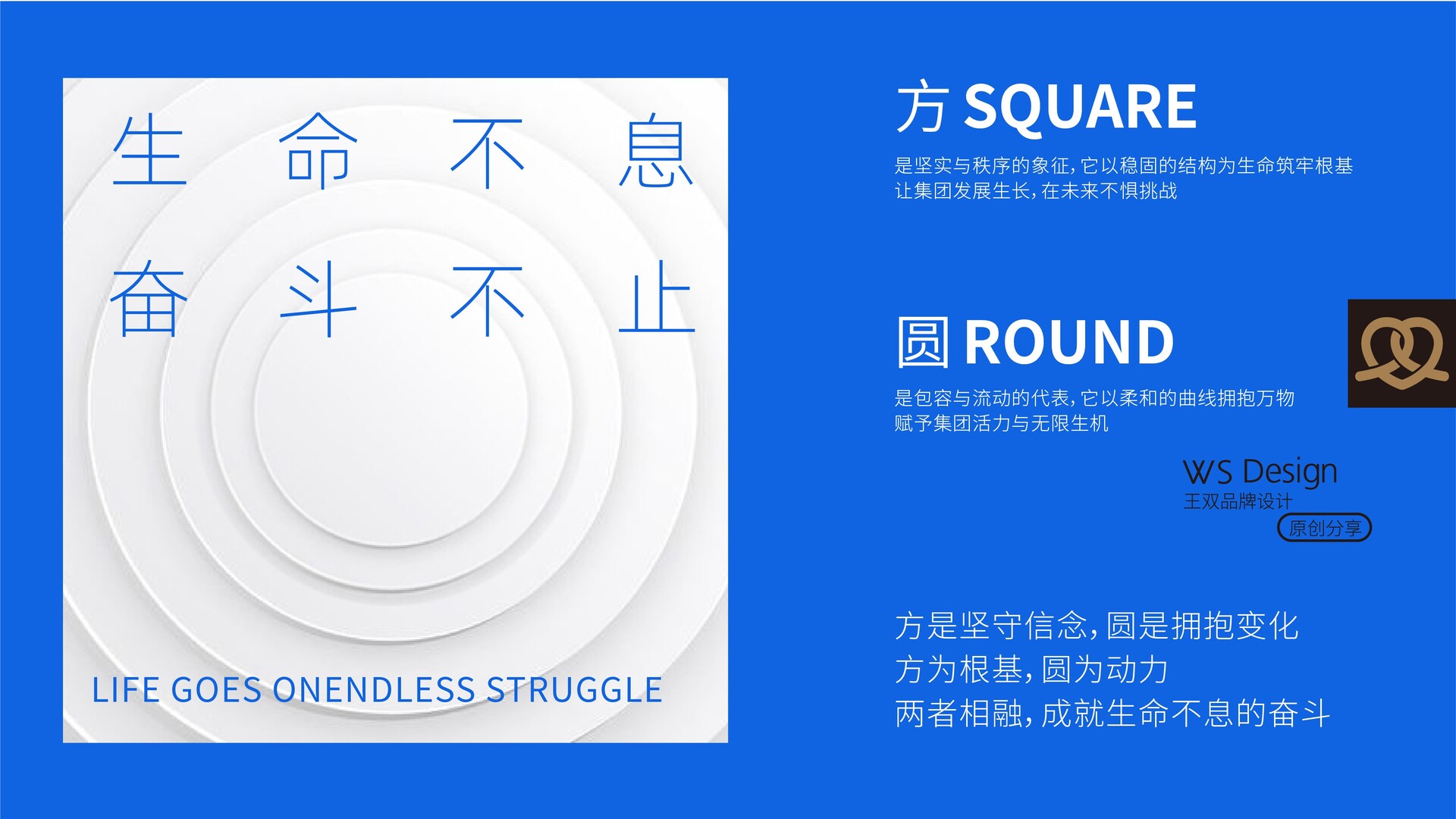
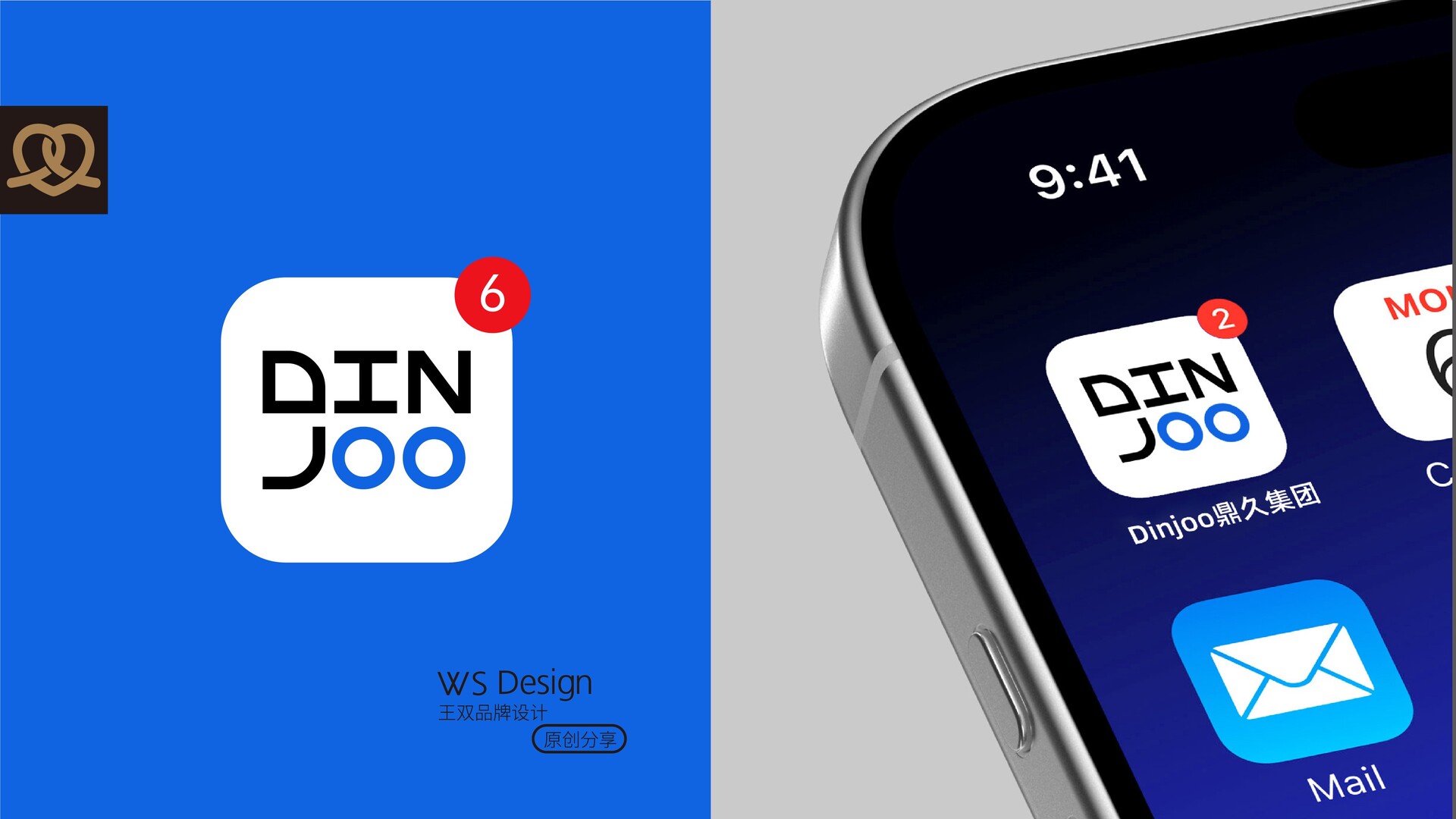
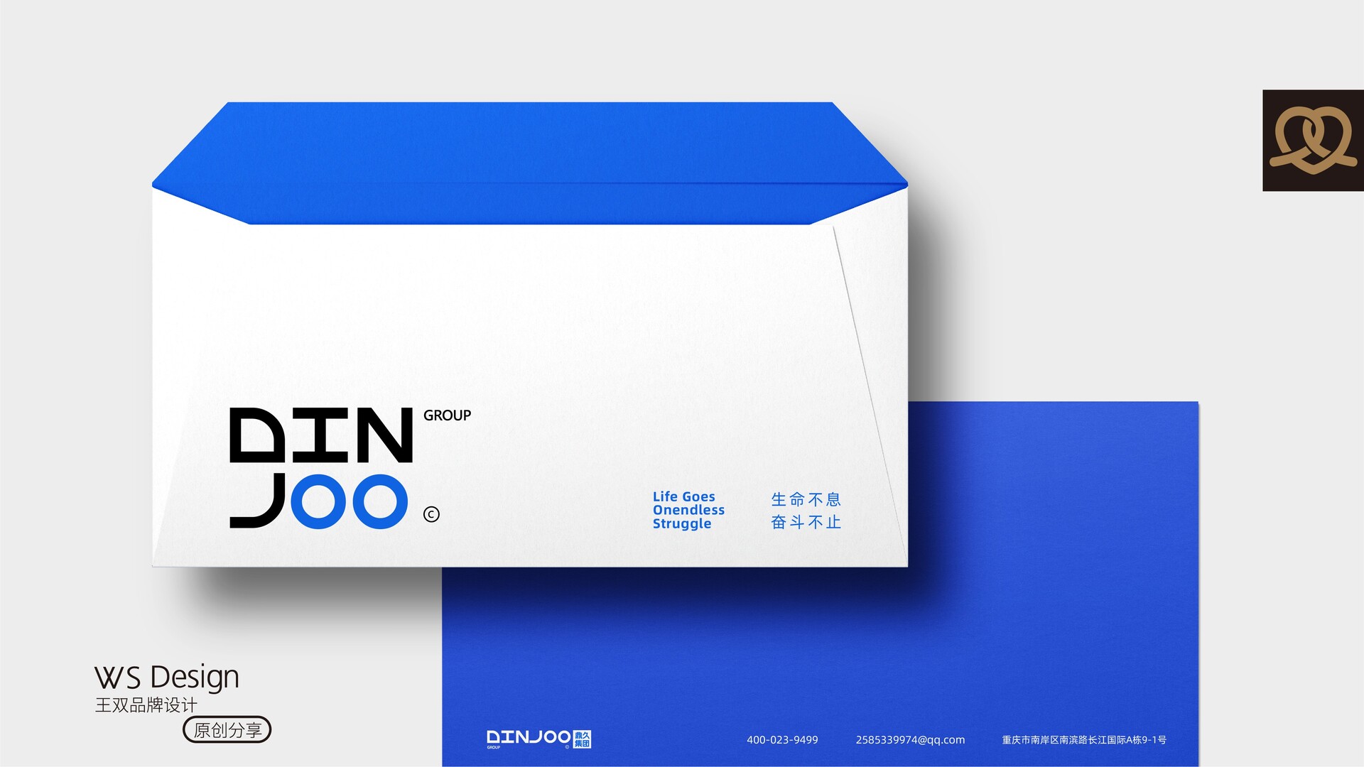
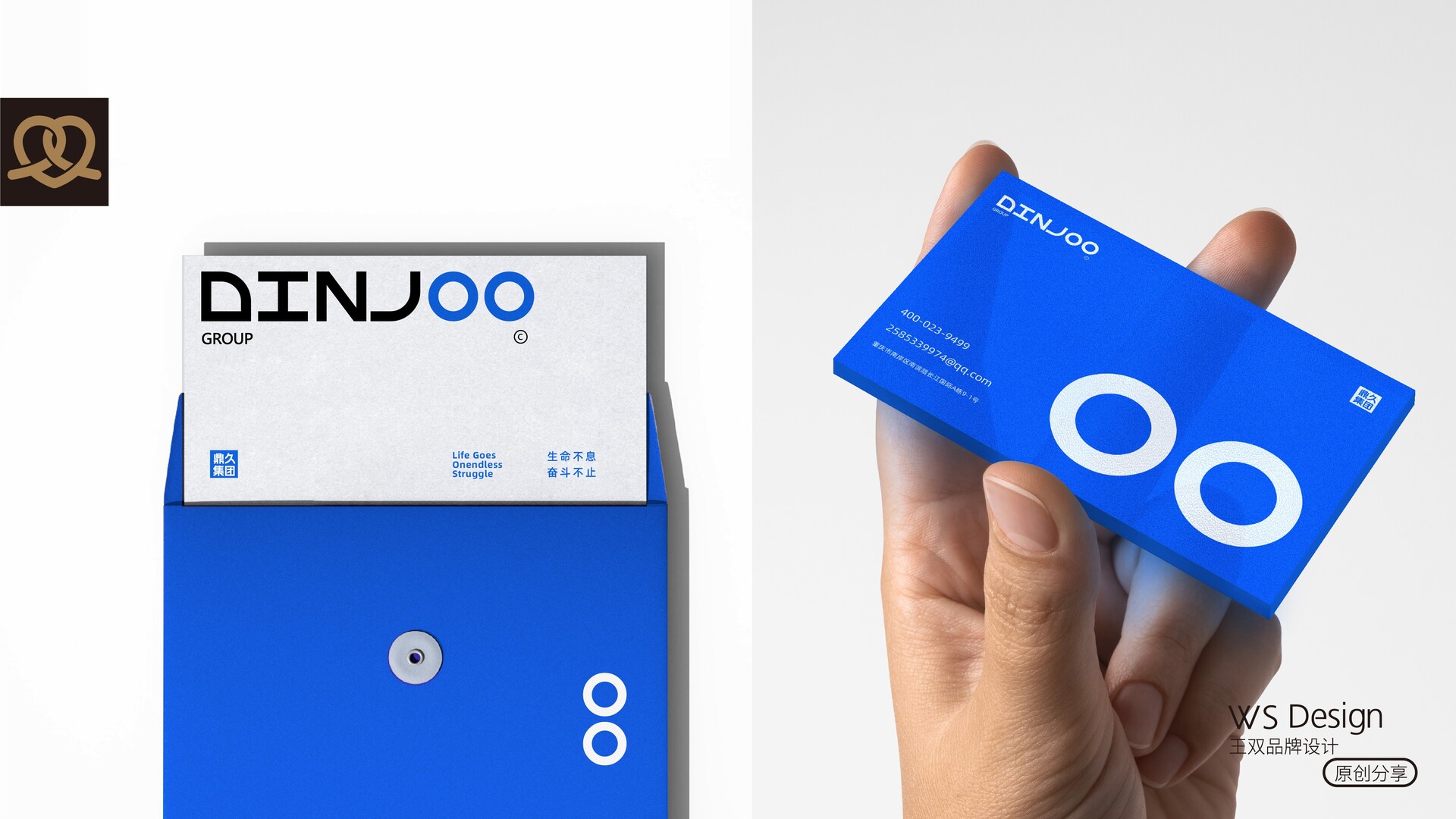
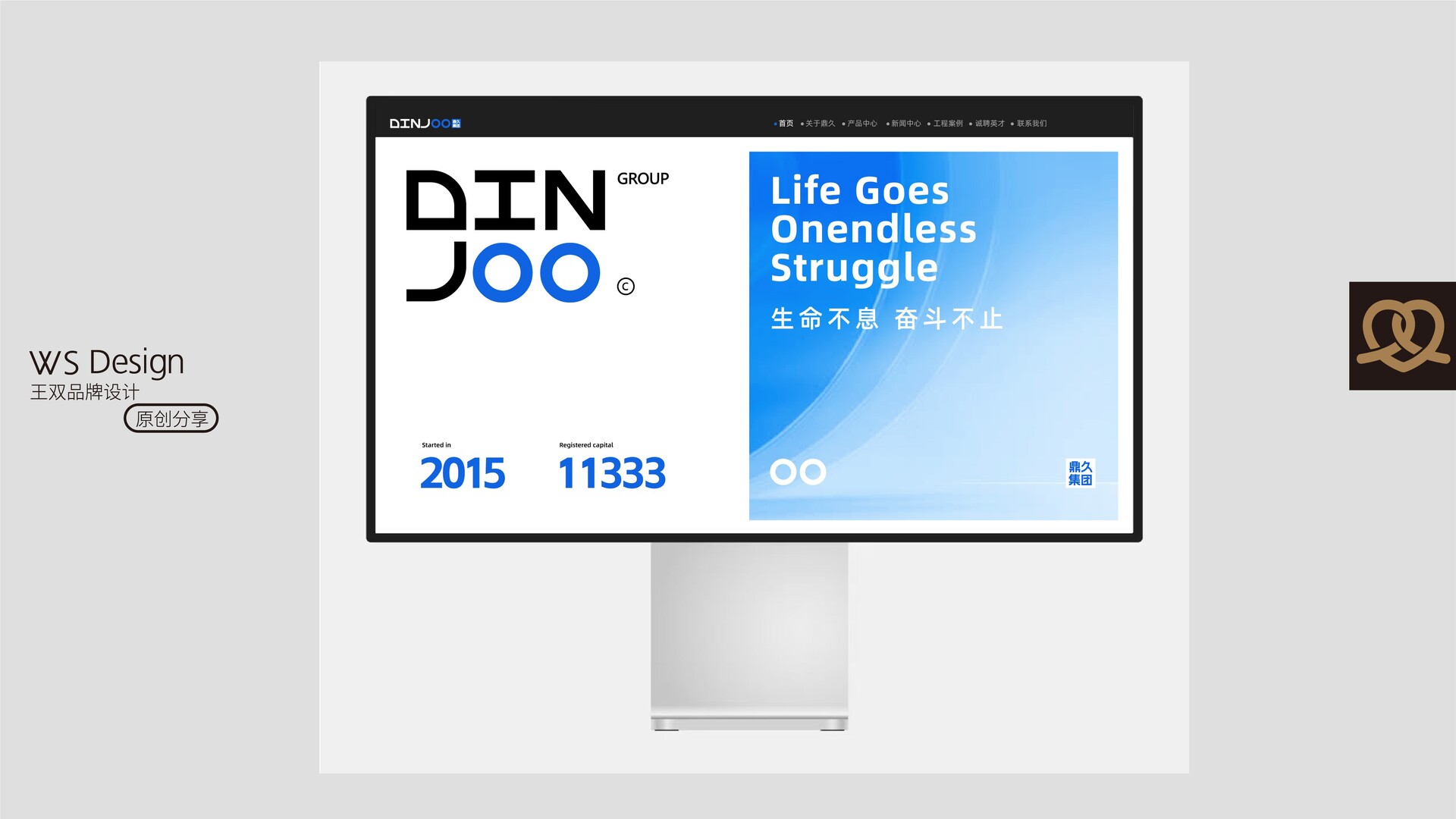
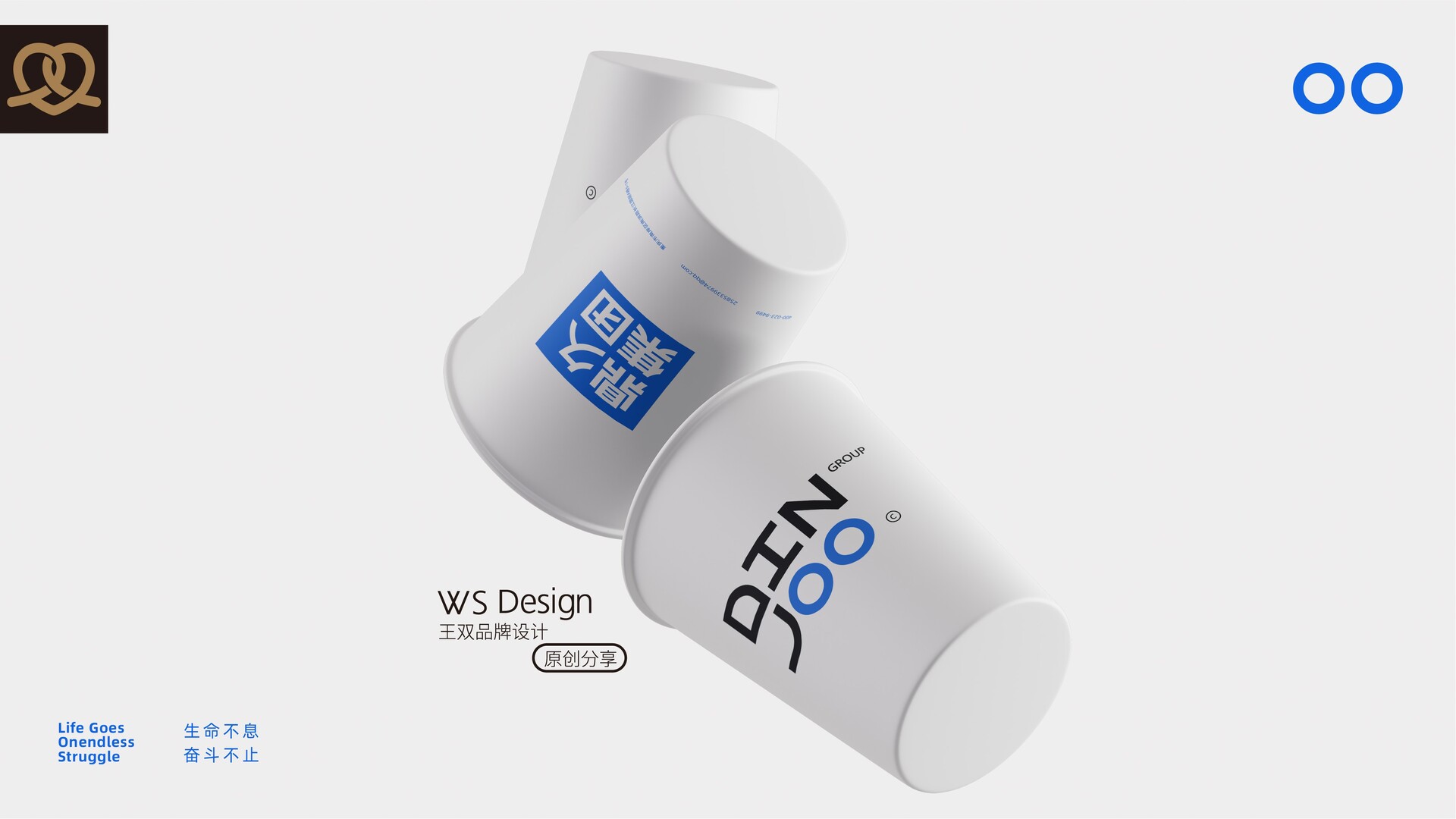
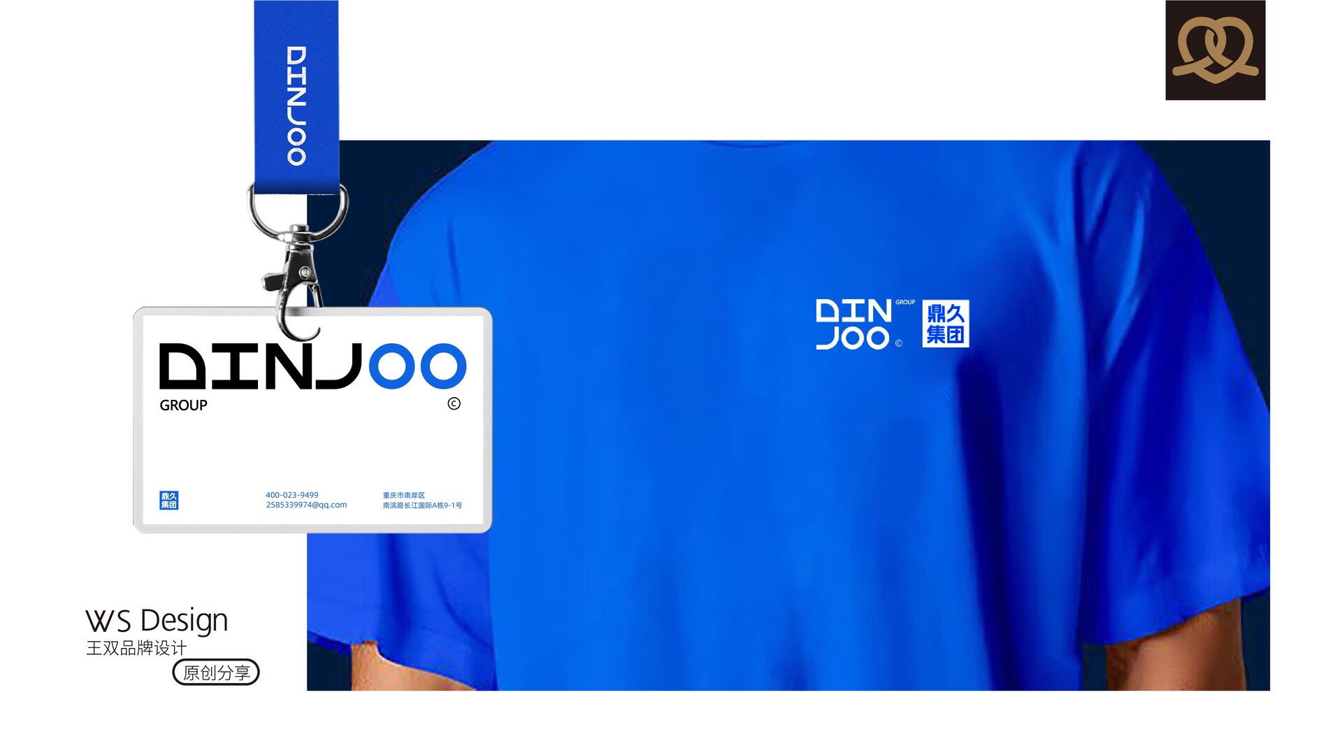
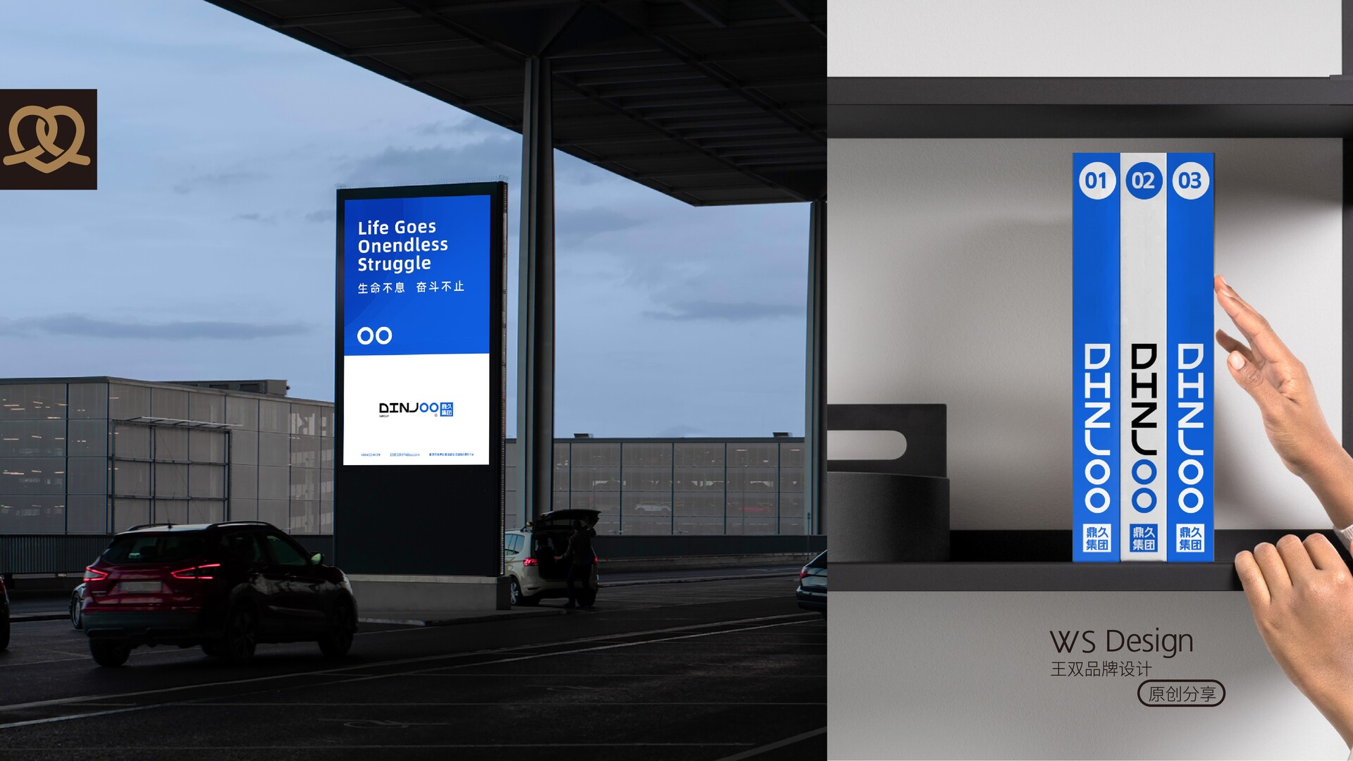
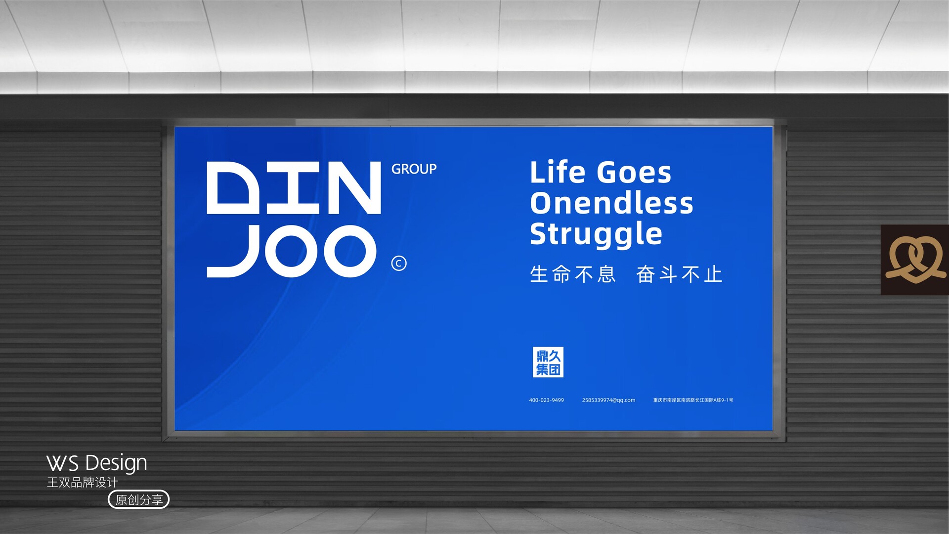
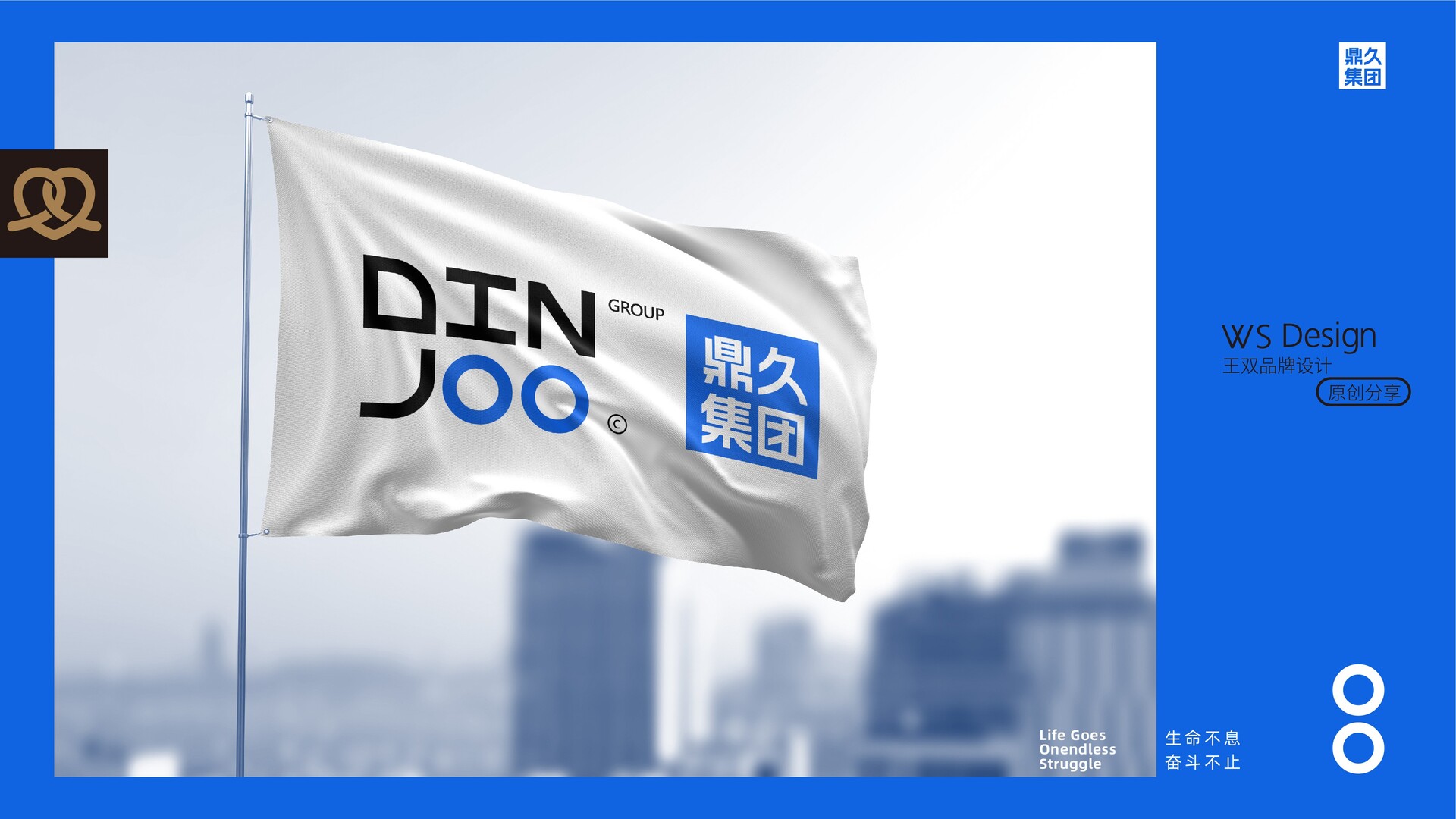
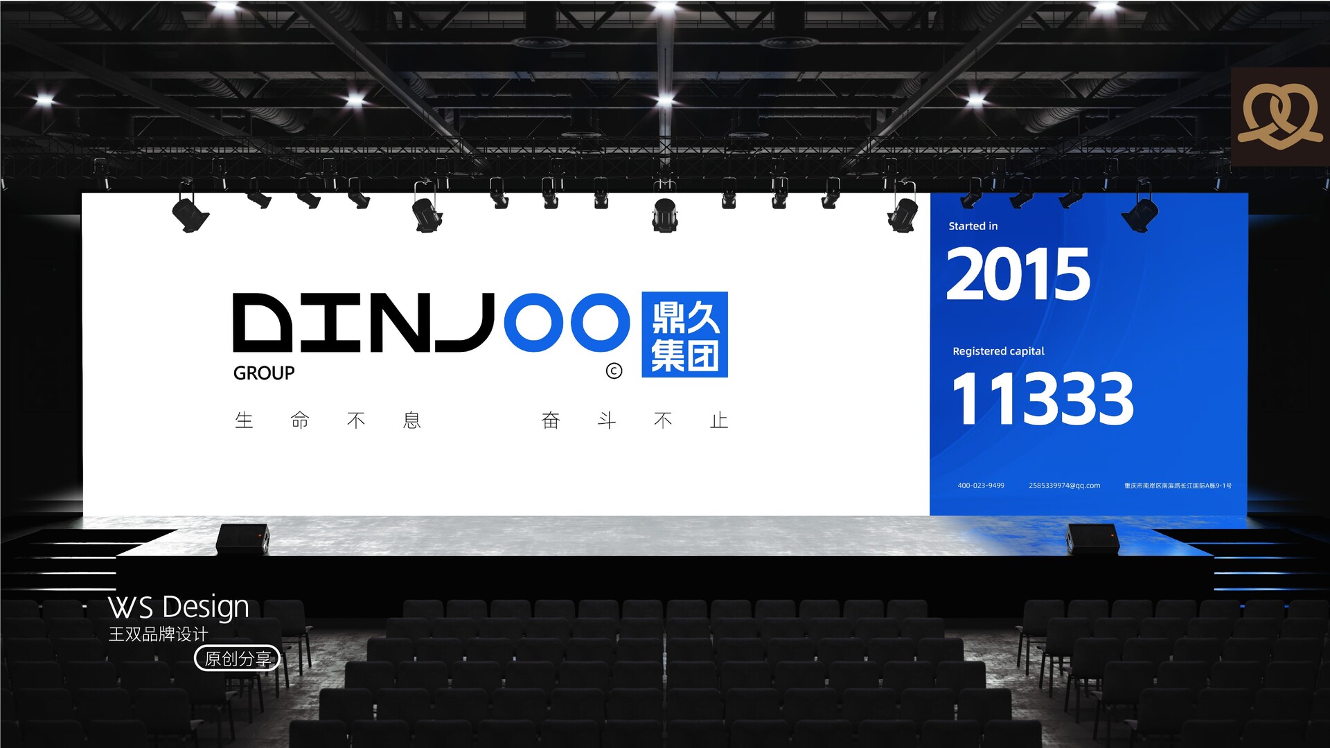
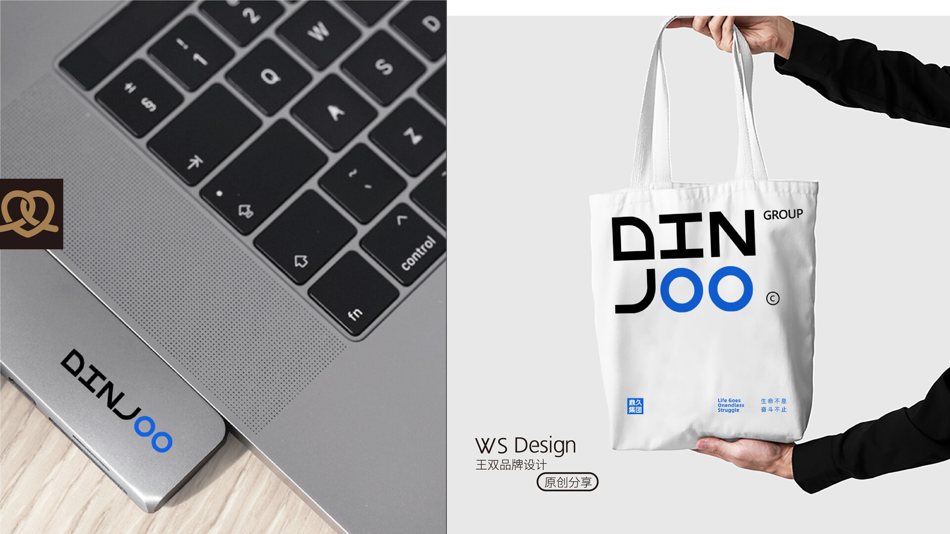
品牌视觉系统展示 | 鼎久集团 DINJOO品牌视觉系统展示|鼎久集团 DINJOO Brand visual system display|DINJOO 标志以中国传统文化哲学“天圆地方”为根基,融合现代产业基因与全球化视野, 方是坚守信念,圆是拥抱变化,方为根基,圆为动力两者相融。构建鼎久集团“生命不息.奋斗不止”的品牌精神内核。 标志中字母“O”设计为蓝色管道造型,直观点明集团从管道实业起步的行业基因。 外廓硬朗的方形框架,象征企业坚守品质(Dedication)与公正原则(Justice),如鼎之稳固,奠定百年基业根基。 管道圆弧形态构成动态视觉焦点,隐喻“连接资源、赋能生态”(Nurture), 同时象征机遇(Opportunity)的流通与创新(Innovation)势能的传递。 色彩上采用了科技蓝,象征数字化转型与全球化布局,标注集团从传统基建向智慧产业升维的未来蓝图。 标志通过“印章-管道”的符号碰撞,将传统文化底蕴与现代产业属性深度结合, 既强化了“诚信为本”的品牌信任度,又凸显了“连接与创新”的行业领导力; 方圆相融的视觉逻辑,更将企业从本土坚守到国际开拓的战略路径可视化,成为品牌文化传播的核心载体。 The logo is based on the traditional Chinese cultural philosophy of "the sky is round and the earth is square", integrating modern industrial genes and global vision. The square is to stick to the belief, and the circle is to embrace change. The square is the foundation and the circle is the driving force. The two are integrated to build the brand spirit core of Dingjiu Group "Life never stops, struggle never stops". The letter "O" in the logo is designed as a blue pipe shape, which directly points out the industry gene of the group, which started from the pipe industry.The square frame with a tough outline symbolizes the company's adherence to quality (Dedication) and justice (Justice), which is as stable as a tripod and lays the foundation for a century-old business. The arc shape of the pipeline constitutes a dynamic visual focus, metaphorically "connecting resources and empowering ecology" (Nurture), and also symbolizes the circulation of opportunities (Opportunity) and the transmission of innovation (Innovation) potential energy. The color used is technological blue, which symbolizes digital transformation and global layout, and marks the group's future blueprint of upgrading from traditional infrastructure to smart industries. The logo deeply combines traditional cultural heritage with modern industrial attributes through the collision of "seal-pipeline" symbols,both strengthening the brand trust of "integrity-based" and highlighting the industry leadership of "connection and innovation";The visual logic of the integration of square and circle visualizes the strategic path of the company from local persistence to international development, becoming the core carrier of brand culture communication.
|

