|
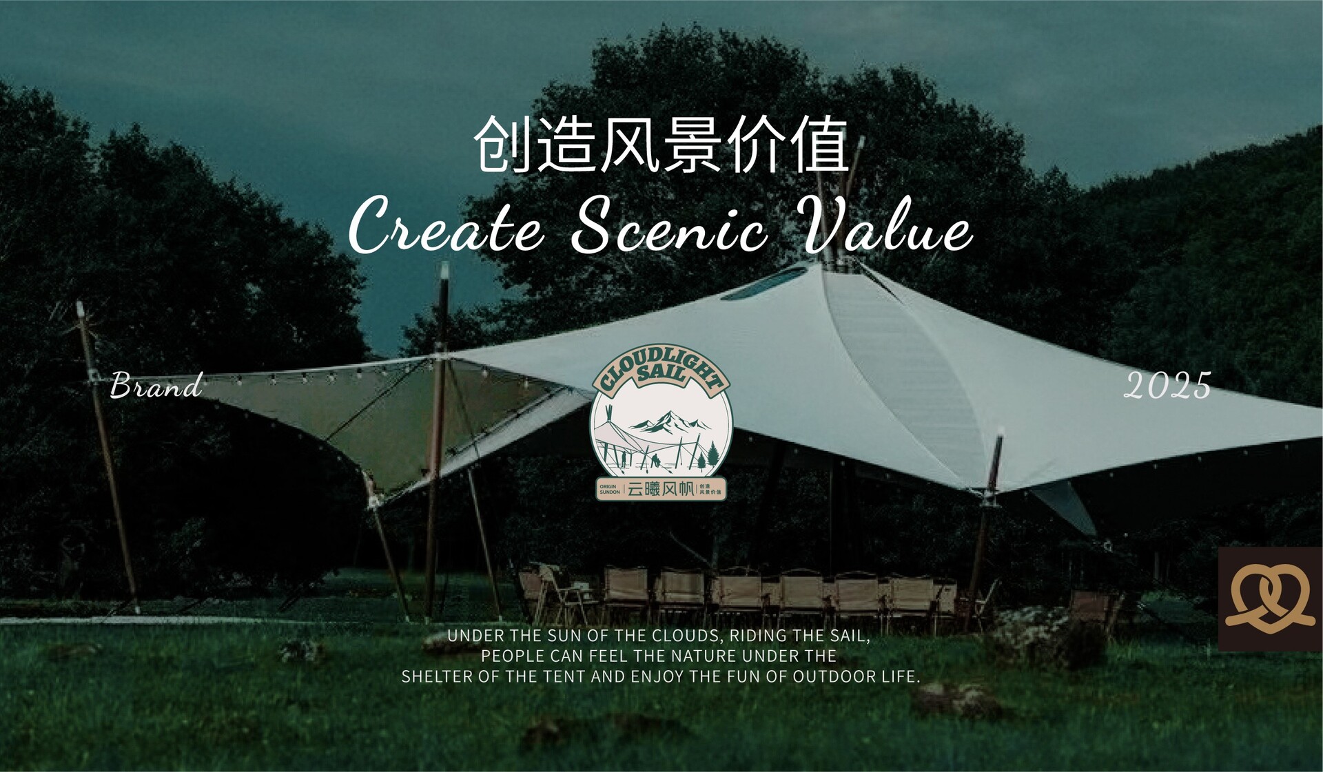
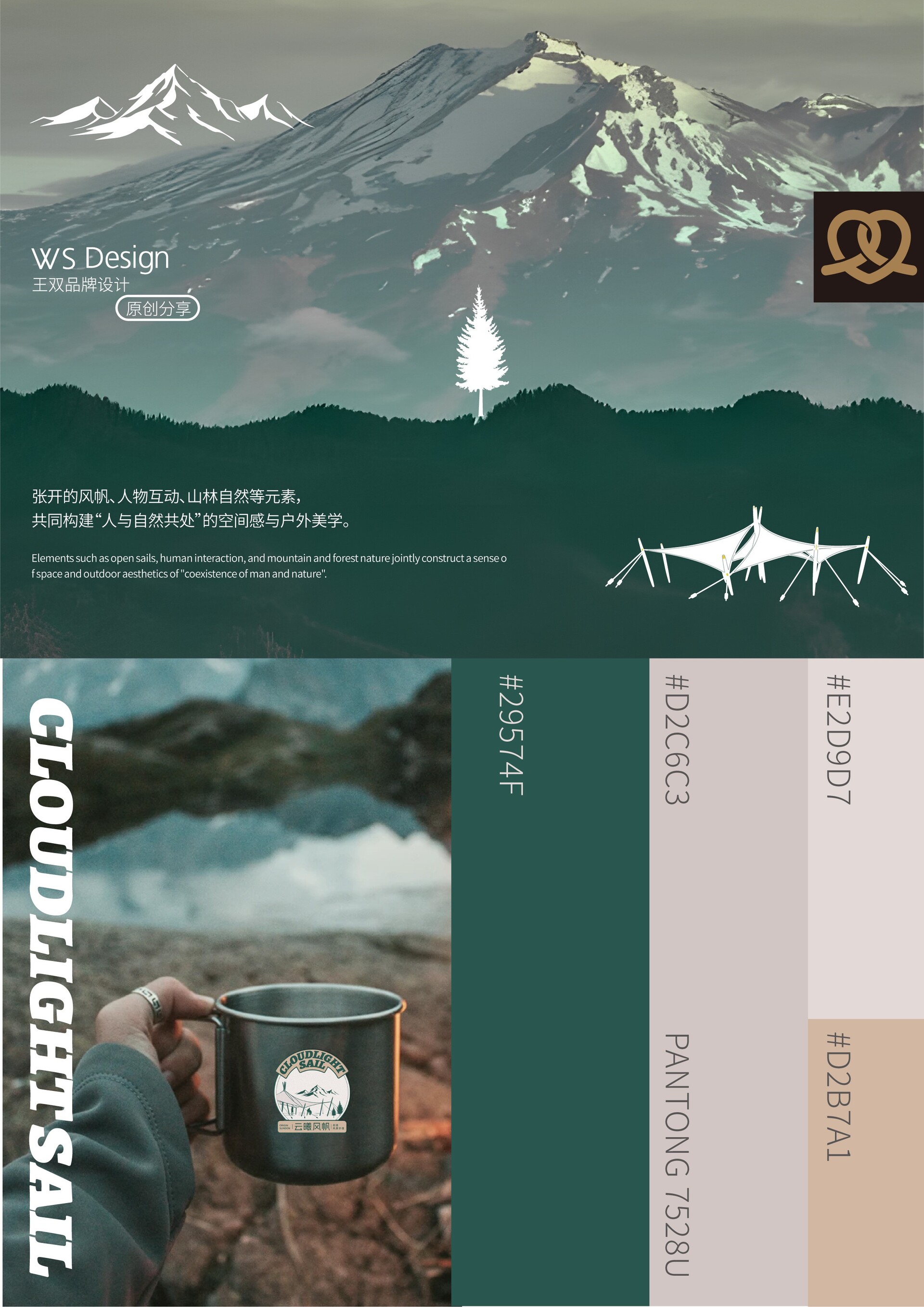
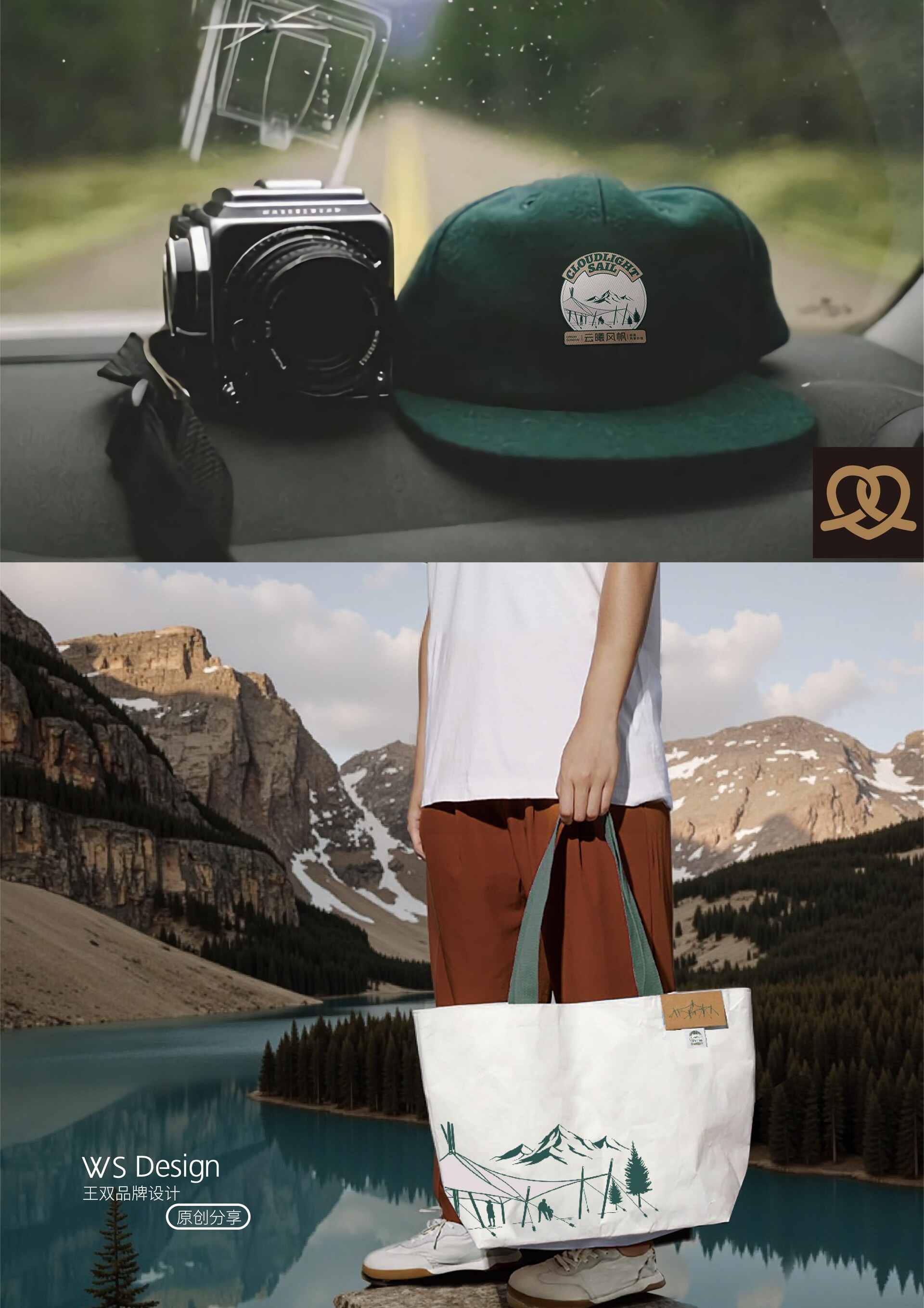
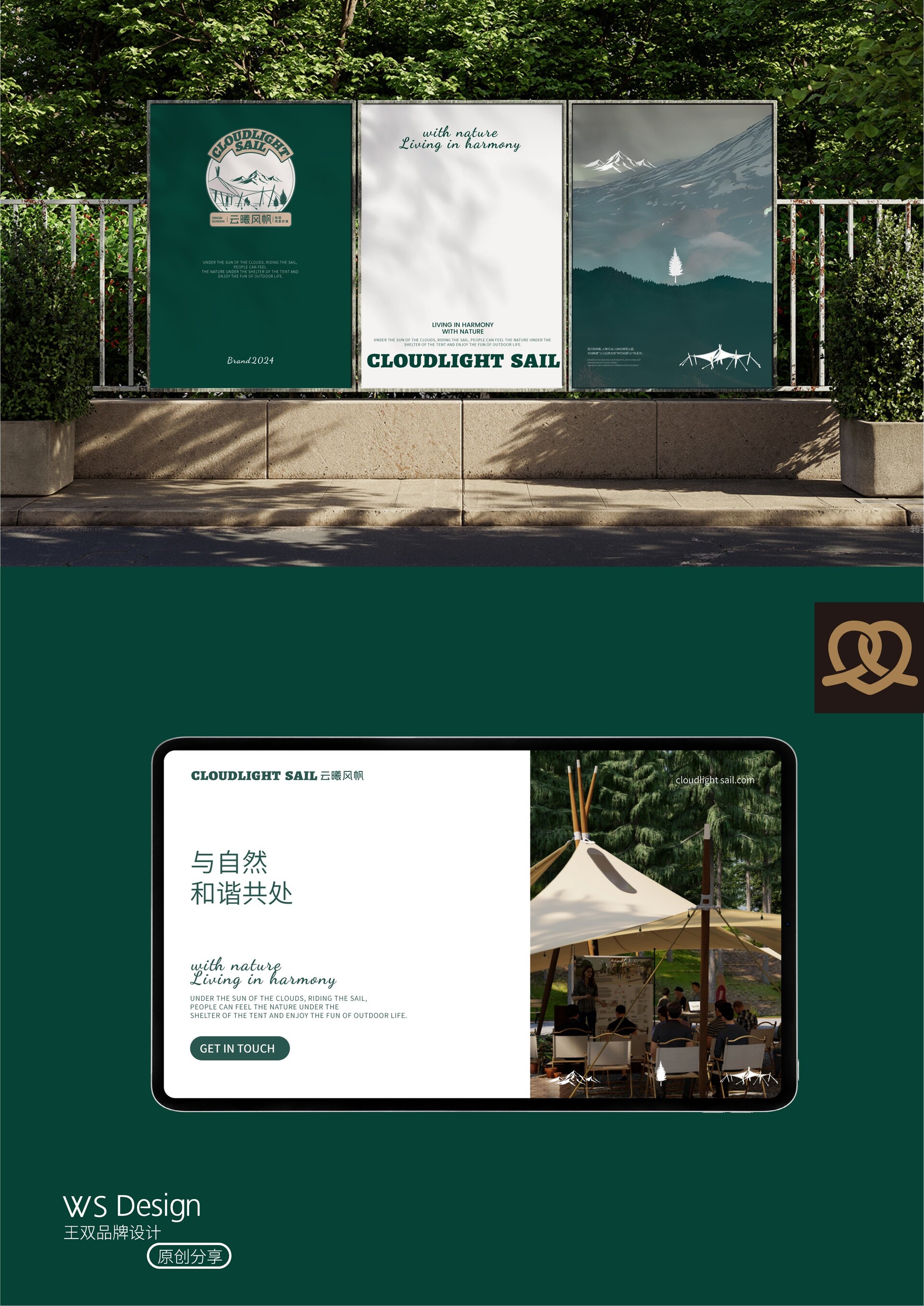
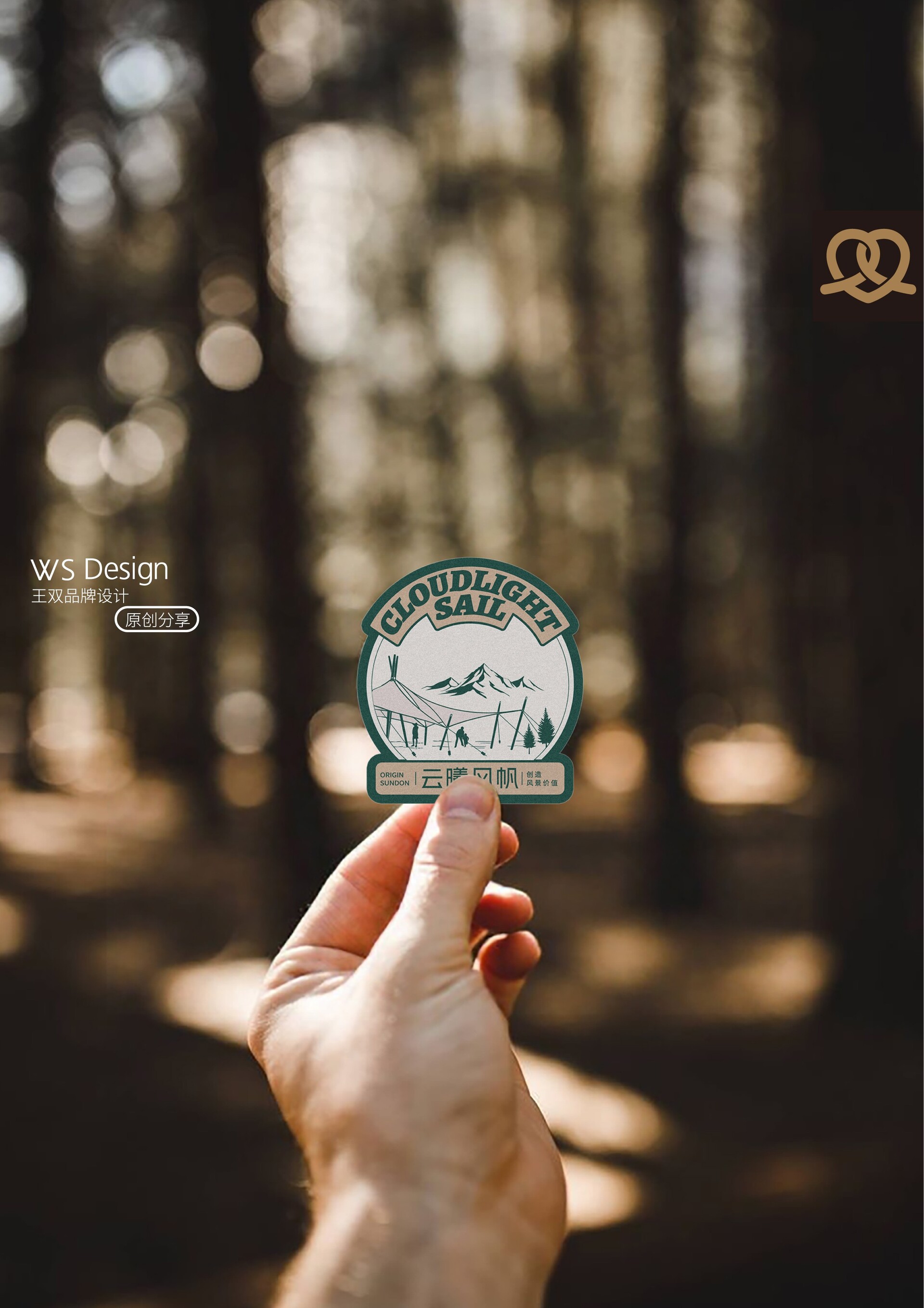
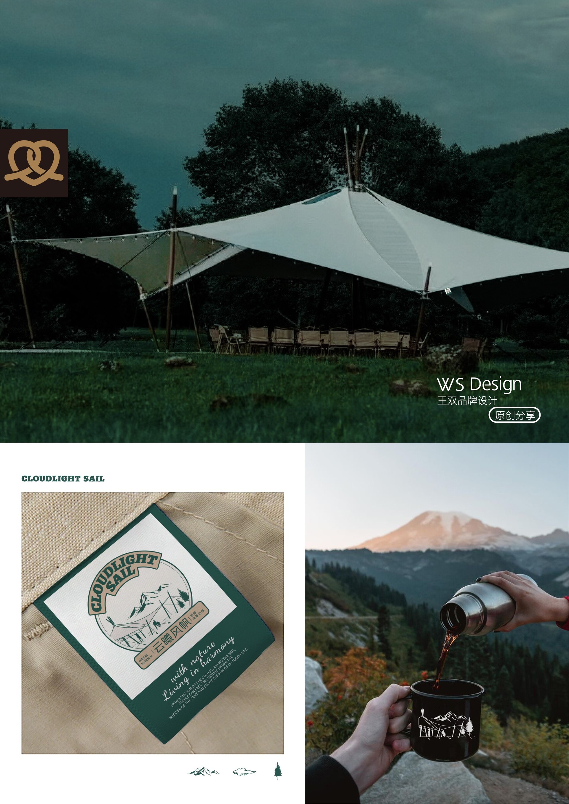
品牌视觉全案设计 | 云曦风帆帐篷品牌视觉全案设计|云曦风帆 Brand visual design|CLOUDLIGHT SAIL 产品核心 - 三根实木交叉的仪式感 第一次看到「云曦风帆」的时候,我真的被它打动了。 核心结构是三根实木交叉,帆布像羽翼一样舒展出去,那种形态,有一种仪式感,甚至带着信仰的味道。 所以在设计它的Logo时,我们最终决定不去修饰它,而是尊重它。 图形灵感 - 与自然和谐共处 图形的灵感,直接源于它的真实结构—— 山与树,帆与人, 每一笔,都来自它与自然之间的那份和谐共处。 它像一位穿着风衣的绅士,走进自然,却从不打扰自然。 这,是我为「云曦风帆」留下的视觉回印。 愿你在它之中,也看见风、光与安静。 Product Core – The Ritualistic Feeling of Three Intersecting Solid Wood Ridges When I first saw "Yunxi Sail," I was truly moved.The core structure is three intersecting solid wood ribs, with the canvas unfurling like wings. That form evokes a sense of ritual, even a touch of faith. Therefore, when designing its logo, we ultimately decided not to embellish it, but to respect it. Graphic Inspiration - Harmony with Nature Graphic Inspiration - Harmony with Nature The inspiration for the graphic comes directly from its real structure—mountains and trees, sails and people; every stroke stems from its harmonious coexistence with nature. It's like a gentleman in a trench coat, entering nature without ever disturbing it. This is the visual imprint I left for "CLOUDLIGHT SAIL." May you also see wind, light, and tranquility within it.
|


