|
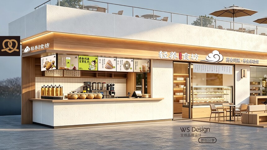
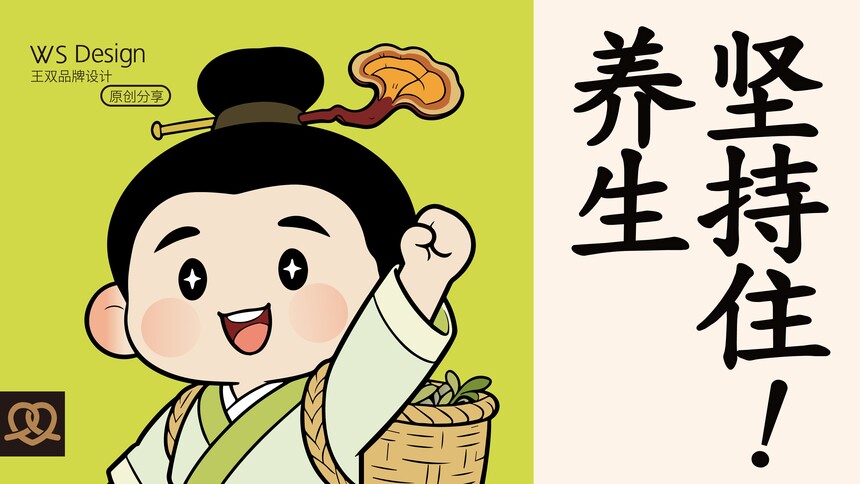
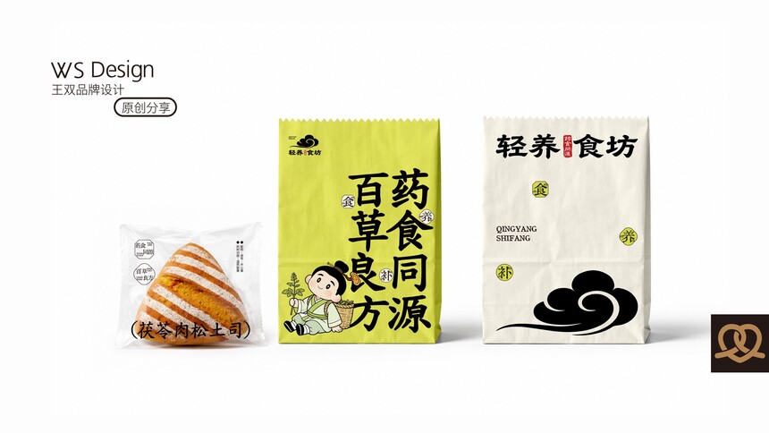
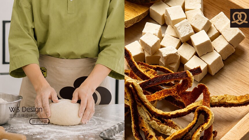
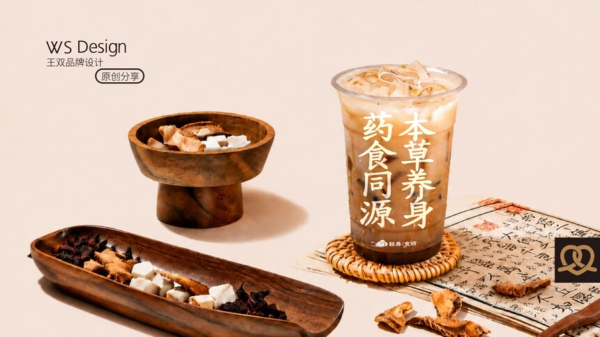
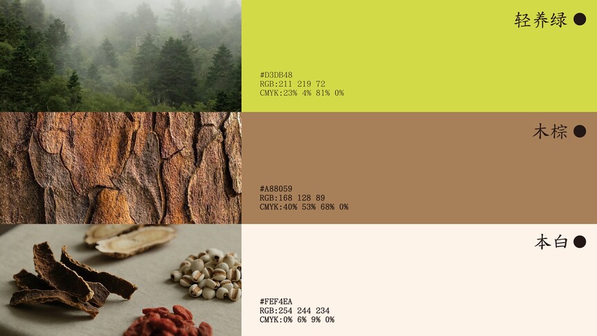
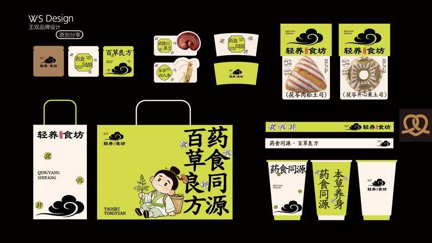
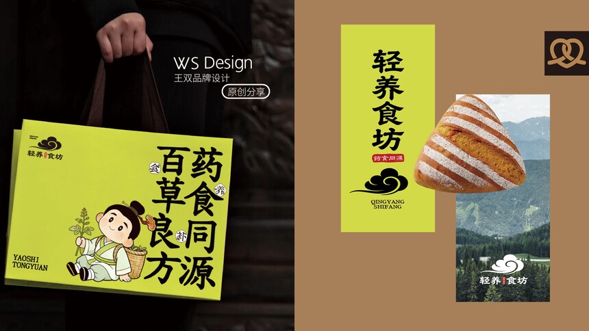
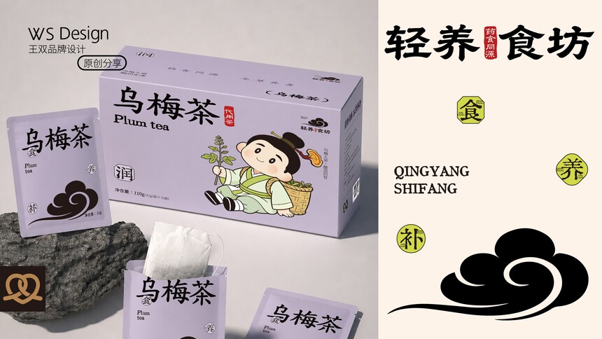
轻养食坊|品牌升级案例轻养食坊|品牌升级案例 Lightly Grown Food Workshop | Brand Upgrade Case 当养生成为年轻人的生活方式,“药食同源”正在从传统中医理念走向大众消费市场。 但大多数养生品牌都面临同一个问题: 理念很好,却离消费者太远; 产品很专业,却缺少品牌温度; 讲养生的人很多,真正让年轻人愿意走进来的却很少。 对于轻养食坊来说,我们希望打造的不仅是一家售卖养生产品的门店,而是一个让年轻人愿意主动接触养生、体验养生、爱上养生的品牌。 经过品牌梳理,我们发现“药食同源”是品牌最核心的价值资产。 中国人讲究食补养身,养生不应该是生病后的补救,而应该成为日常生活的一部分。 因此,我们将品牌核心价值聚焦为: 药食同源 · 百草良方。 让传统养生文化从药柜里走出来,走进年轻人的餐桌与生活。 在品牌视觉上,我们提炼中国传统文化中的祥云元素作为超级符号,赋予其“顺遂、福气、轻养”的文化寓意;同时结合本草绿、木棕色、本白色等自然色系,建立属于轻养食坊的东方养生美学。 在产品体系上,我们围绕药膳烘焙、养生茶饮、轻养食品等多个品类展开开发,将茯苓、人参、乌梅等传统本草食材融入现代消费场景,让养生变得更轻松、更日常、更容易坚持。 同时,通过品牌IP“小药童”、门店空间、包装系统以及传播物料的统一打造,让原本严肃的养生文化变得更加年轻、亲切和有趣。 本次升级的本质,不是在塑造一个传统养生品牌。 而是在创造一种新的生活方式。 让养生不再是长辈的习惯,而成为年轻人的选择。 让更多人相信: 真正的养生,不是刻意进补。 而是在日常饮食中,慢慢把身体养好。 When nutrition becomes a way of life for young people, "food and medicine being the same" is moving from traditional Chinese medicine concepts into the mass consumer market. But most health supplement brands are facing the same problem: The idea is good, but it is too far from the consumers. The product is very professional, but lacks the brand's warmth. There are many people talking about health preservation, but very few of them can truly attract young people to come in. For Light-Care Food Shop, what we aim to create is not merely a store selling health products, but a brand that encourages young people to actively engage with, experience and fall in love with health concepts. After conducting a brand review, we discovered that "food and medicine sharing the same origin" is the core value asset of the brand. Chinese people attach great importance to dietary therapy for maintaining health. Health preservation should not be a remedy taken after getting sick; instead, it should become an integral part of daily life. Therefore, we have focused the core value of the brand on: Medicine and food share the same origin · Hundred herbs for good health. Let the traditional health preservation culture emerge from the medicine cabinet and enter the dining tables and lives of young people. In terms of brand visual design, we have extracted the auspicious cloud element from Chinese traditional culture as a super symbol, endowing it with cultural connotations such as "prosperity, good fortune, and gentle care"; at the same time, by combining natural color schemes like herbal green, wood brown, and light white, we have established an Eastern health aesthetics for the Light-Care Food Workshop. In terms of the product system, we have carried out development in multiple categories such as medicinal cuisine baking, health tea beverages, and light-nourishing foods. We integrate traditional herbal ingredients like poria cocos, ginseng, and plum into modern consumption scenarios, making health preservation more effortless, more routine, and easier to adhere to. At the same time, through the unified creation of brand IP "Little Medicine Boy", store spaces, packaging systems, and promotional materials, the originally serious health preservation culture has become more youthful, friendly and interesting. The essence of this upgrade is not to create a traditional health and wellness brand. Rather, it is about creating a new way of life. Let health preservation no longer be the habit of the elderly, but become the choice of the young. Let more people believe: True health preservation is not about deliberate supplementation. Rather, it is through daily diet that one gradually recovers their health.
|